Chorley Hospital gives children a Younique® experience
Washroom design using Formica® Laminate helps inspire tomorrow’s doctors and nurses.

The refurbishment of a 1930s building by multi-disciplinary practice, Frank Whittle Partnership Limited, into a state of the art children’s educational centre is the first of its kind in the UK. The architects specified Younique® by Formica Group for the washrooms at this ground breaking NHS experience centre at Chorley & South Ribble Hospital.
The new LIFE (Learning Inspiration Future Employment) centre offers the people of Lancashire from the age of 5 upwards the unique opportunity to learn about various hospital operations while gaining a greater understanding of the NHS and its functionality.
The centre is set up with a range of departments including mock wards, A&E, X-ray and triage. A state of the art 3D experience theatre allows children to find out more about the human anatomy, diseases and healthcare, offering real insight into the day to day goings on of a hospital.
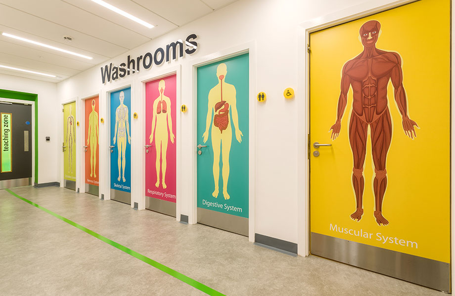
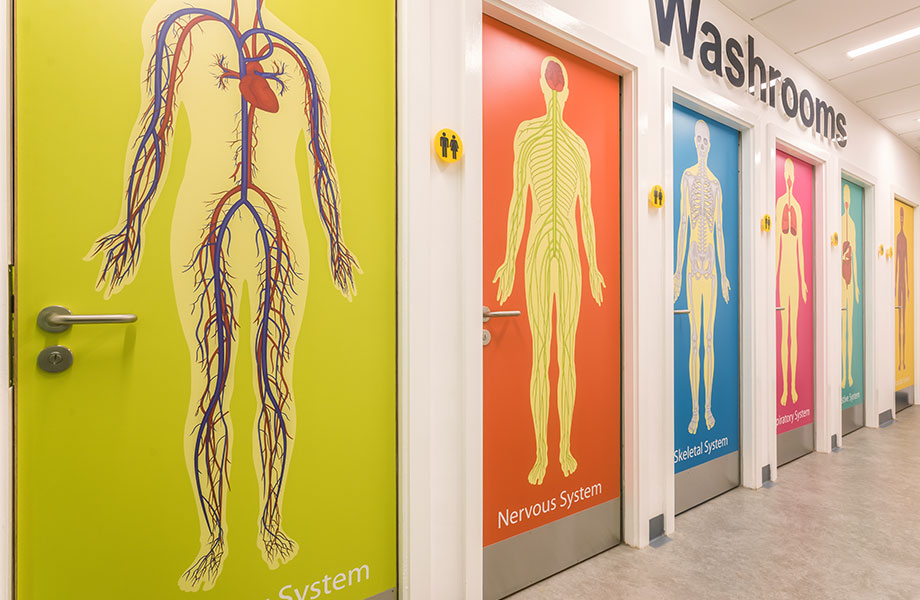
In the washrooms, the use of Younique by Formica Group’s digitally rendered panels has enabled the project team to create a fun design feature with an educational theme on the toilet doors. Formica® laminate has also been used for the lockers and IPS (integrated plumbing systems) to provide a consistent aesthetic.

David Simmons, associate partner and interior designer, Frank Whittle Partnership Limited, comments: “Due to the project being for such a wide age range, we set out to ensure the design appealed to all age groups and was practical at the same time. On receiving the brief, our design was inspired by the very nature of the building’s purpose. Working with the forward thinking Widening Participation Team, who welcomed exciting and innovative ideas, helped too.”
Frank Whittle Partnership Limited focussed the design on what the future of hospital wards could look like. All rooms have been colour coded to aid with direction around the centre. For example, a purple scheme leads the way to the ward area with the beds clad in timber featuring purple banding to continue the theme. Each area is distinct and inspiring, and although clinical, they break-away from the sterile look that is mostly associated with hospital ward design.
David continues: “We were looking for something different for this very exciting project and this included the design of the toilets too. We wanted these to be appealing to all age groups, yet somehow incorporate an educational theme. Our solution was to design the washroom doors with different images to illustrate the various body systems.
“Formica laminate was a natural choice for this project, not just in terms of its aesthetic capabilities but also in regards to the surface material’s properties being ideal for the healthcare environment. We have used Formica Group products for years so we know how well it performs and we have never had any issues. The Younique by Formica Group collection allowed us to print images of our choice which was perfect for what we wanted. We’d never used Younique before and we’re extremely happy we did.”
David concludes: “From a design perspective, the project stimulates visual interest throughout, from the colour coded zones to the bespoke graphics. However, the most important aspect is how the centre will be used to educate young people and the enthusiasm by everyone that was involved in the job.”


